Friday, January 18, 2008
Howling Queries
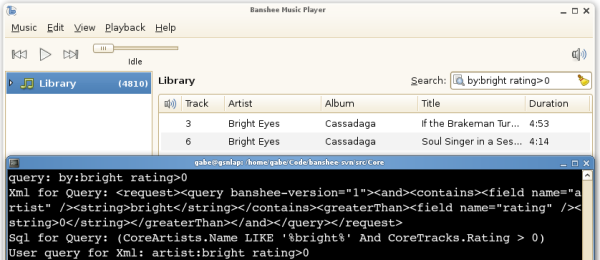
Banshee's search code is getting revamped. Before getting into the technical discussion, I want to note that simple queries that you can perform in stable today will most of the time produce the same results in trunk. In trunk, the default operator in user-queries is AND, so a query dave matthews is parsed as dave AND mathews. Filtering is done in real-time as you type, and mal-formed queries are handled gracefully. You can also specify fields (by:dave, album:"under the table", rating=4).
Trunk is well organized into assemblies that break along logical boundaries. One of these assemblies is called Hyena, and contains reusable data-oriented classes. I want to highlight one namespace in it that has come a long way in the last few weeks.
Hyena.Data.Query
The fundamental data structure in Hyena.Data.Query is the QueryNode tree, made up of QueryTermNodes (literal values, field queries) and QueryListNodes (and, or, not).
We have two parsers, UserQueryParser and XmlQueryParser, as well as methods to take a tree and produce user or XML queries. This means we can go from a user query to XML and back, or vice-versa. Given a list of queryable fields and their mapping to Banshee's database (a QueryFieldSet), we can also take a tree and produce SQL for actually carrying out the search. You can see all this in action if you run trunk from a terminal:
Subscribe to:
Post Comments (Atom)
Improved Query, sounds very nice :-)
ReplyDeleteYour search infrastructure sounds fantastic, but it's almost worthless for users who don't have the patience or ability to learn your query syntax. For technical people like you and me, these kinds of query strings are self-explanatory and we already know how they parse before using Banshee. Take a look at how Apple does it: https://ysearchblog.com/i/podcast-itunes-full-crop.jpg You if you were to create an extremely simple widget that could translate its state to and from XML queries, it would allow people to really take advantage of all of your hard work.
ReplyDeleteI'm not saying that I want Banshee to replicate iTunes features, but in this case I think we can learn something really important about how best to let average users search for music.
David,
ReplyDeleteWell, we aim to have the search entry work well for people who don't know anything about what it supports and those who do. If you right click on a song, you can choose "search by matching artist/album" - and in trunk, all this does it populate the search entry with "by: X" or "on: Y", giving the user a hint they can type it in themselves too.
Another idea is to make the smart playlist editor really just an advanced search dialog, with the option to save (to smart playlist). If you didn't save, it would simply translate your query to user-query and put it in the search entry.
I'm not sure I totally understand your point wrt the iTunes feature; what do the "All | Author | Title" buttons even do? The type buttons make sense, but we can't expose every search field in this way. Can you clarify what you'd like to see in Banshee?
David (again!),
ReplyDeleteOh, if you want to see an attempt (not sure how successful) to making an intuitive search interface, we certainly tried hard on F-Spot:
https://gburt.blogspot.com/2006/09/tag-searching-in-f-spot.html
:)
Gabriel,
ReplyDeleteFor some reason, search UI is treated as a second-class feature of music jukebox/management software like Banshee. For example, you just made the claim that the (vague) feature I suggested is available by right-clicking on a song or opening a playlist editor window. I have 10,000 songs in Banshee -- I always search for my music before I play it; that is, every single time I begin playing music in Banshee, I will have just searched for that music. It's ludicrous that search UI enabling casual users to search easily would be hidden in a contextual menu or in a "new playlist" dialog.
Yes, the iTunes screenshot is confusing -- it's the best I could find on Google. What I'm suggesting is that Banshee make search as accessible and enjoyable as possible. iTunes doesn't offer a GUI representation for every feature of their query language, but iTunes does offer a convenient graphical representation of the kind of filtering that people want to do 99.9% of the time -- that is by media type (music vs movies vs podcasts), by field (artist vs album), etc. I don't think they let you filter by stars or length, but you can imagine how easy it would be to have a ratings widget that, when clicked, filters the library list for songs corresponding to that rating. You could also have a slider for song duration, for example. Maybe this screenshot of another program that offers similar filtering features will help explain what I mean: https://mac.softpedia.com/screenshots/12-885_3.png
David,
ReplyDeleteI hardly think putting the search entry in a prominent, standard position (top right of the app) with all sorts of common keybindings to focus it (/, ctrl-f, etc) is making search a "second-class citizen" in Banshee.
Right clicking on a song and choosing "find by artist" is certainly not the only way to do such a search; it is just a means for discovering the power of fields in the search entry.
And I think the screenshot you linked to, with drop down boxes to filter your search is ugly and cumbersome (which is why we put it in a dialog). We have a menu that pops up when you click on the search entry icon, to change it to filter on artist/album/etc. It's been in stable forever, and in trunk when it's made to work, it will simply add "by:" etc to the start of the entry.
We do have an artist/album browser in trunk, which is itself a simple GUI for searching. But it doesn't scale to your 10K song library very well (except when combined with other forms of filtering).
I do like the idea of a ratings filter, though it should probably be done with an additional menu item in the search menu could be "Rating" with a submenu to select the minimum (which would, of course, just enter rating>N in the entry). Ratings might be important to you (and quite a few people) but there are many fields, and adding more than one or two to the main UI will clutter it.
You say you always search before playing anything. I understand that. But I don't see how you're going to search a 10K song library w/o typing.
I don't mean to pick on Banshee in particular. Maybe I have an eccentric opinion about this, but I think menus should be used sparingly. Also, right-clicking on songs to filter by their criteria is a nice feature to have, although I don't use it much because first I need to find a song among thousands to right-click, effectively requiring two separate searches to get the results I want. Challenging some of my earlier assumptions, I've realized that just because you can support complex searches that exploit song metadata, that doesn't mean that people want to do that. Most of the time I just write a query of one or more conjuncts and I usually get precise enough results. On the other hand, I do not think that supplementing your query text field with some more filter-oriented UI (like F-Spot's) would add unwelcome complexity. I think the artist browser is good, too.
ReplyDelete